BRANDING | MERCADO SÃO PAULO
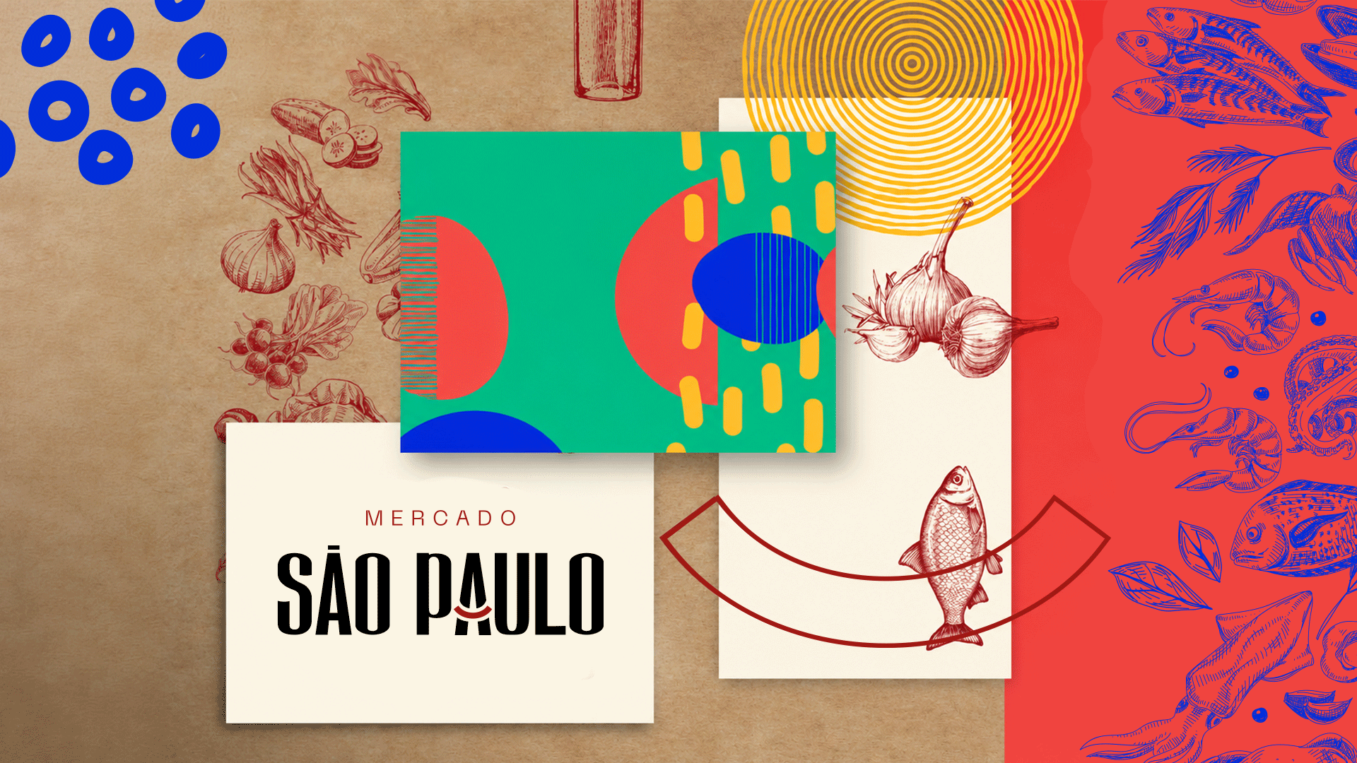
There are projects that give shape to a longstanding relationship. A relationship between a place and its people, built on culture, tradition and encounters that make an address part of a community’s history.
Mercado São Paulo already held that history in its flavors, in the conversations between stalls and in the warmth of its welcome. Its personality came to life every day, but its visual presence was still limited to a sign with a name and an address. It needed a brand that could express this bond.
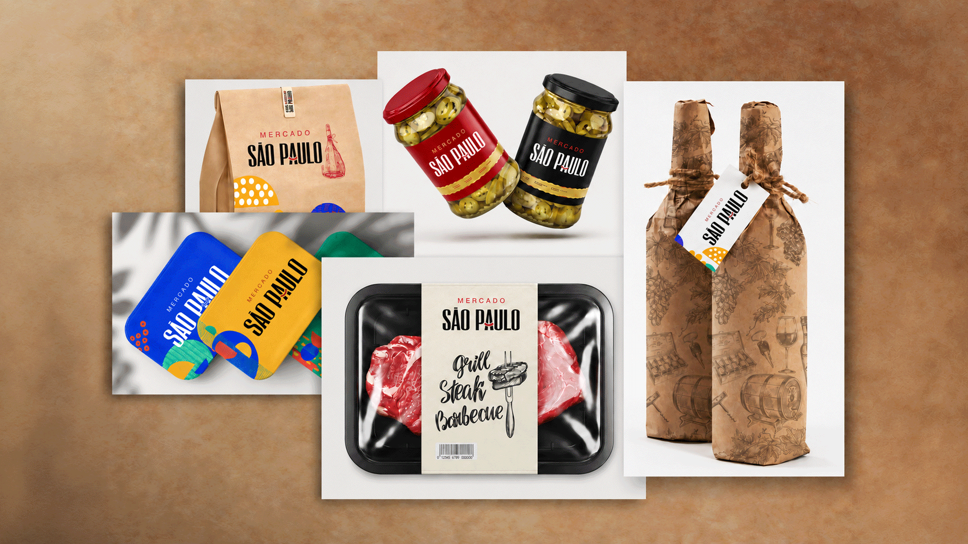
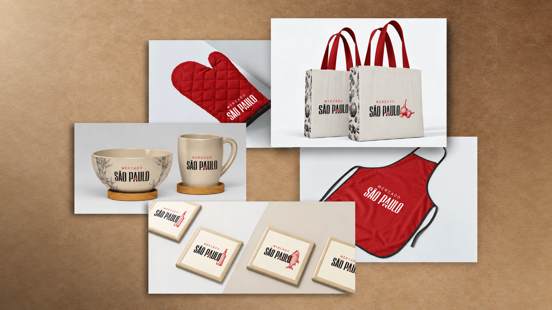
This project set out to turn that relationship into an identity. To give shape to tradition and affection, creating a brand that feels familiar to those who already belong and welcoming to those who have yet to arrive.
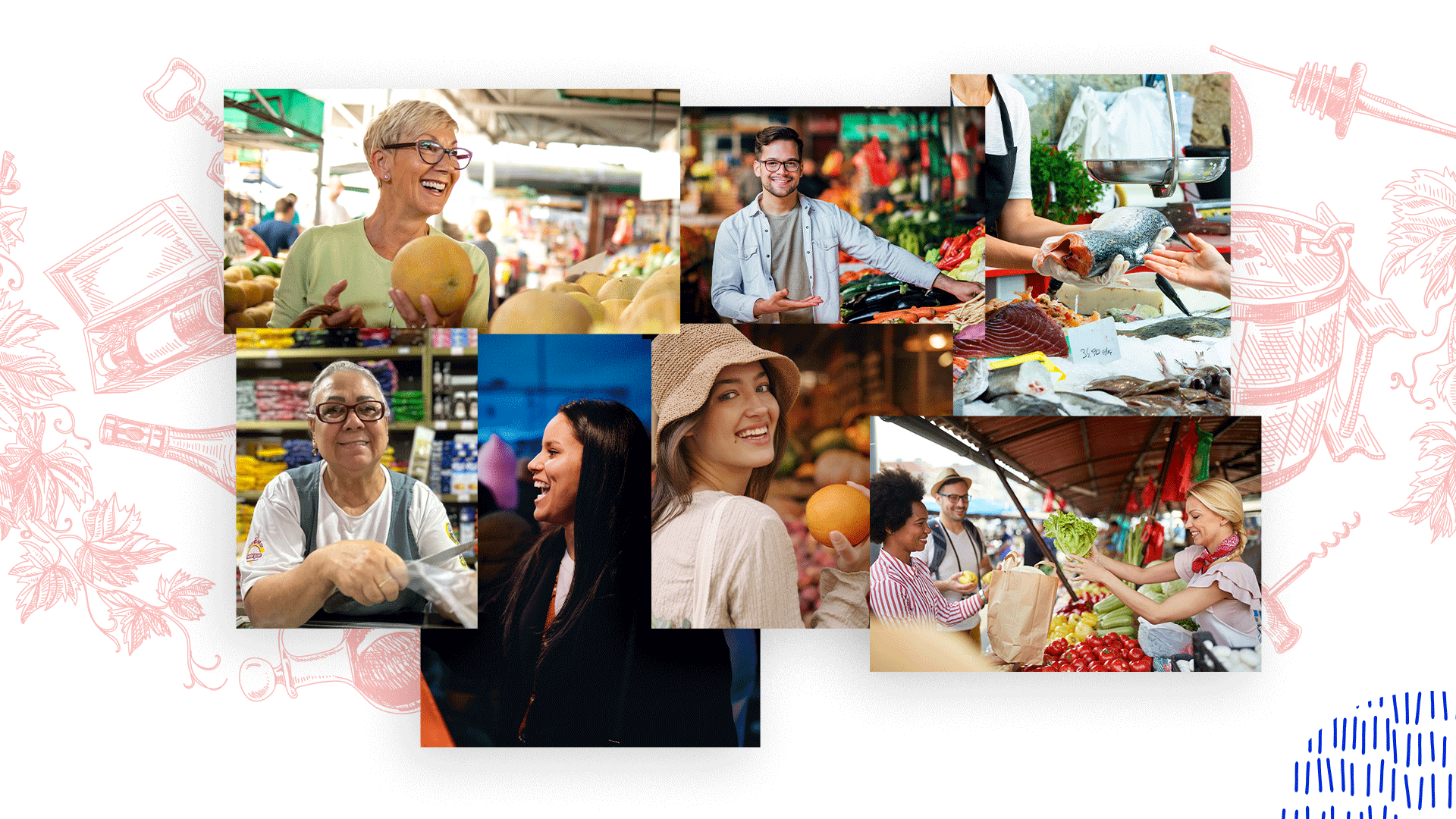
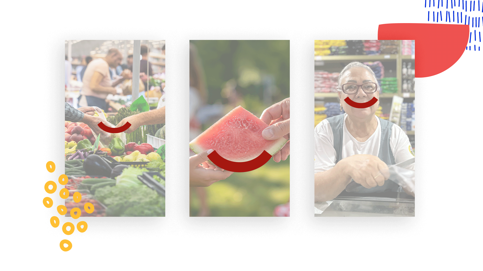
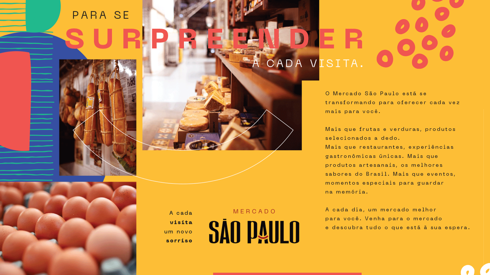
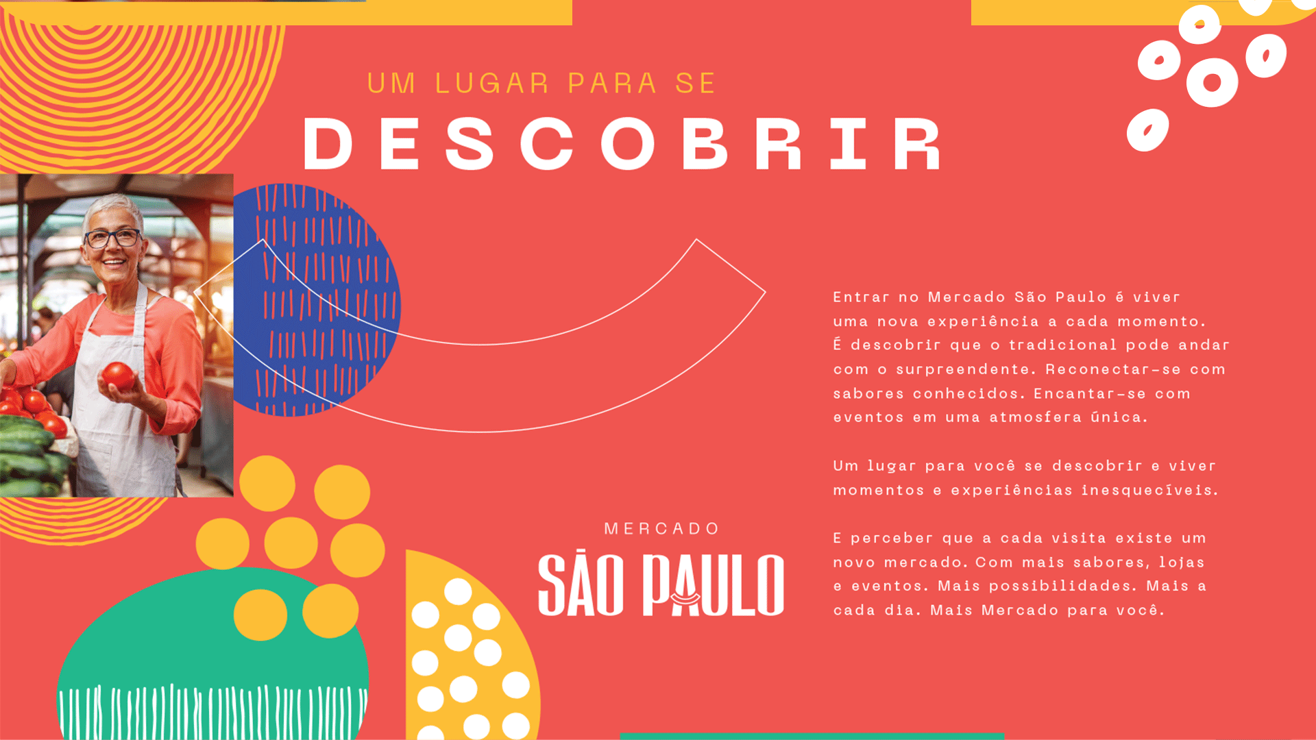
The identity of Mercado São Paulo brings together familiarity and discovery: the reassurance of returning to a place you know and the pleasure of finding a flavor, a product or a thoughtful gesture that makes that visit special. The brand gives shape to this bond, built through small, everyday experiences.
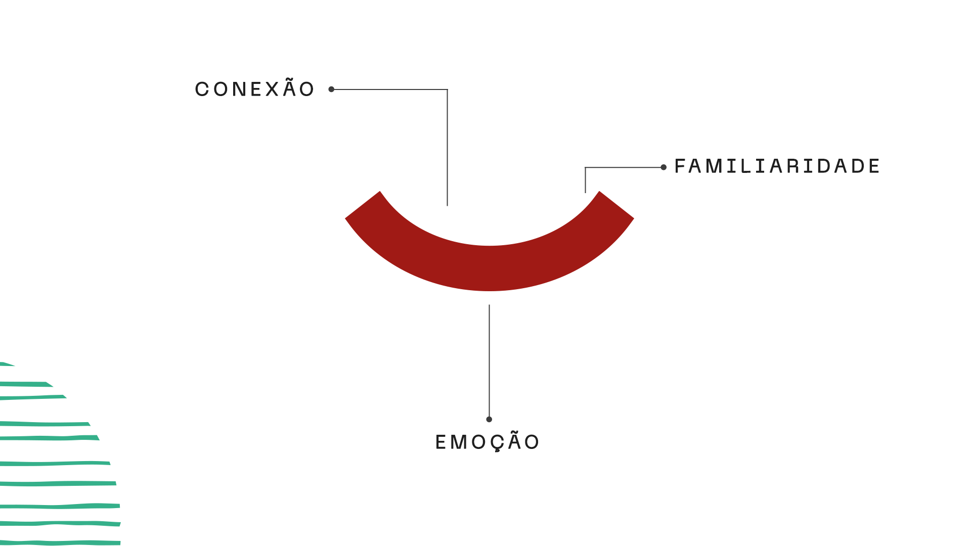
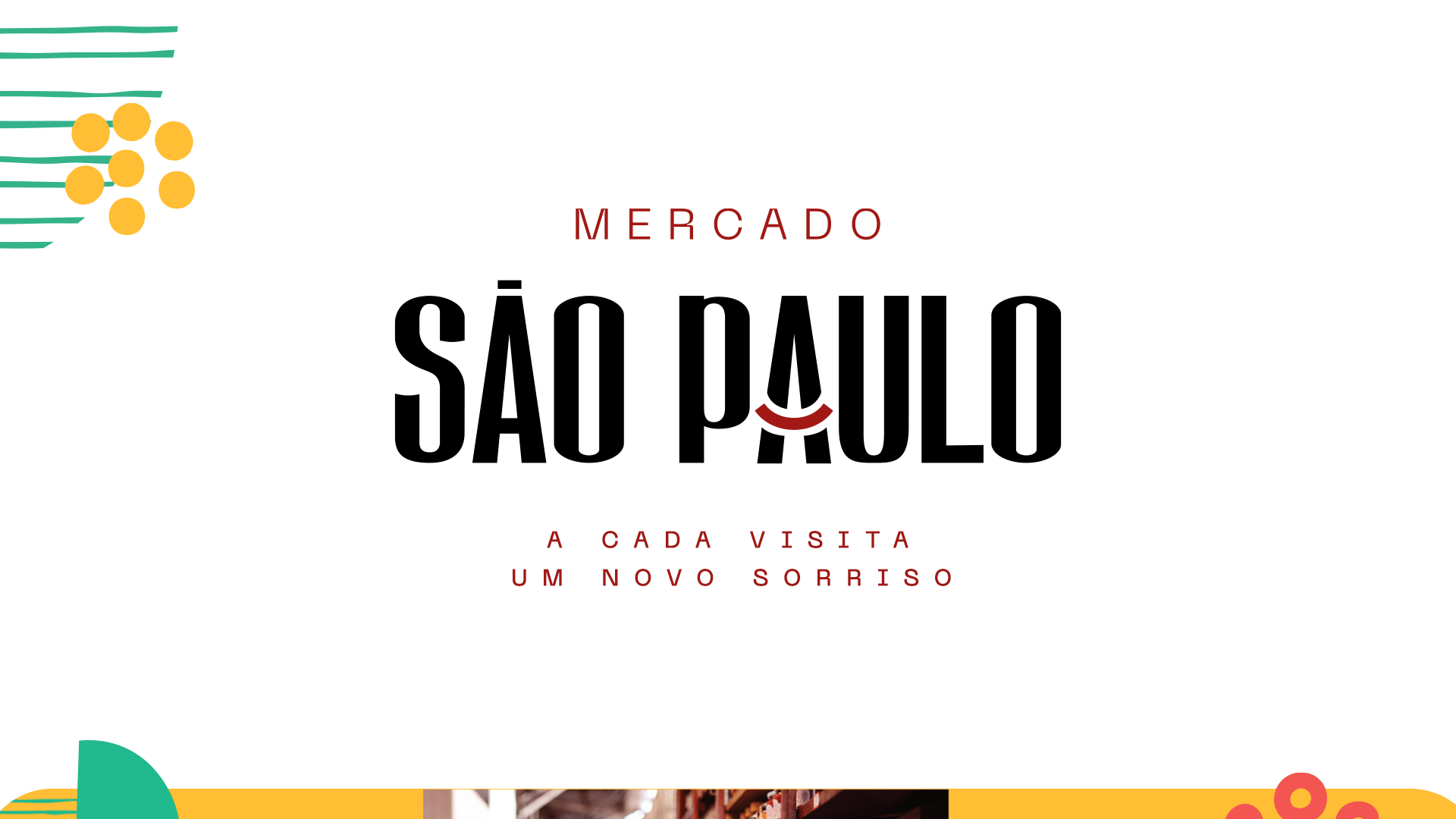
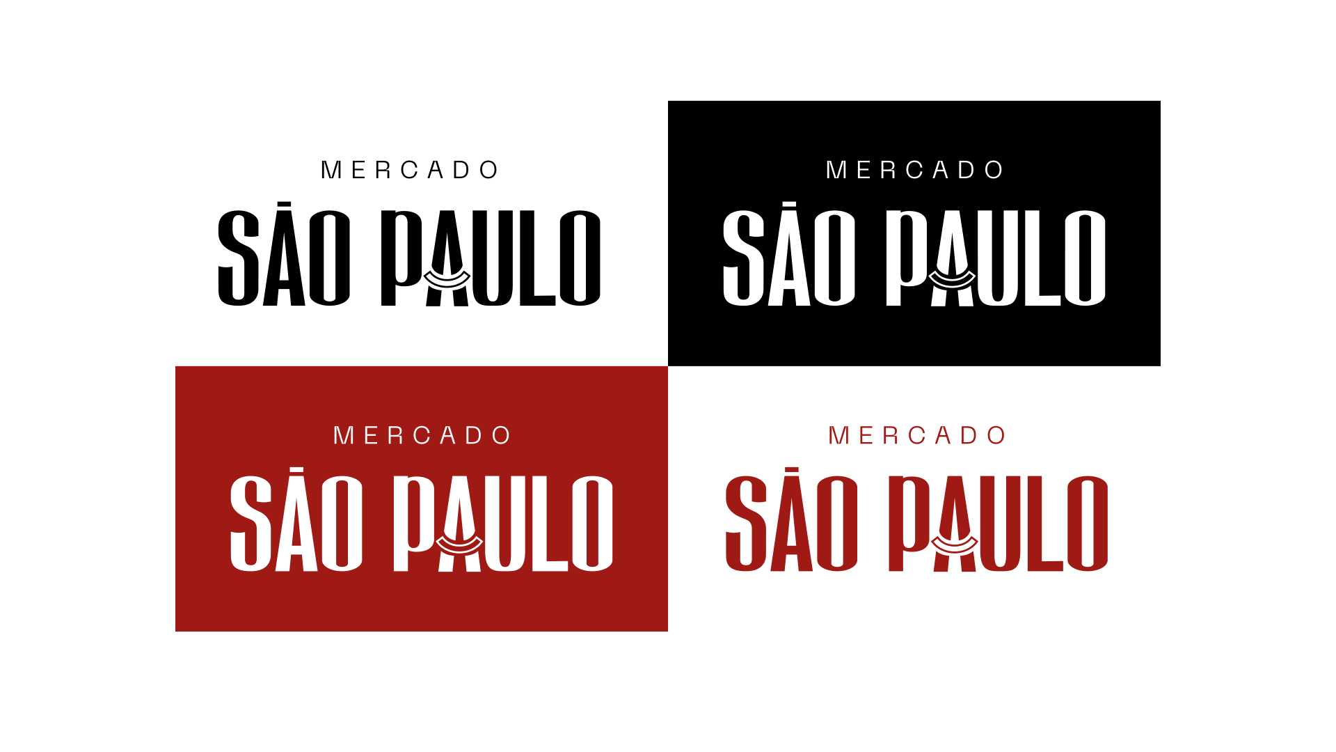
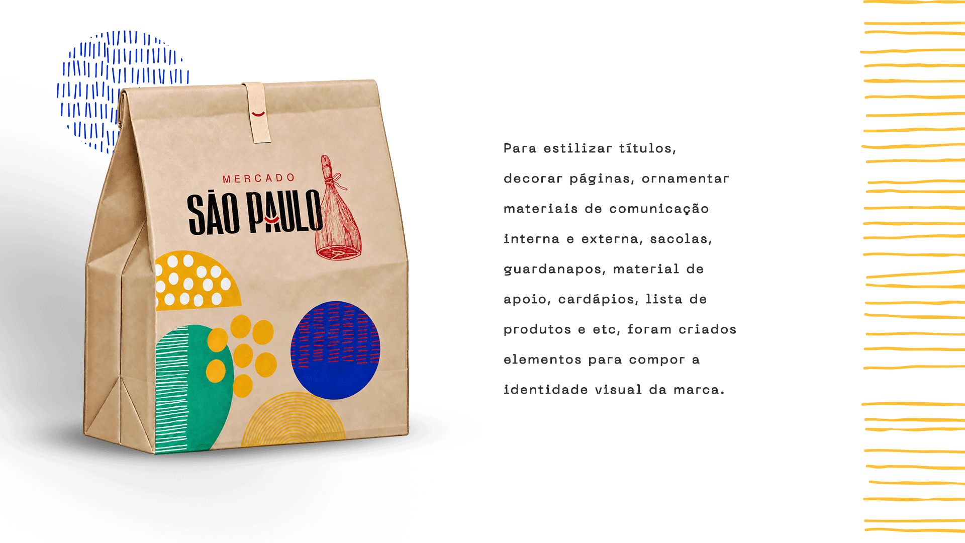
The curve of the symbol runs through this world. It appears in the smile of someone offering a warm welcome or finding what they were looking for, in the shapes of fruits and vegetables, and in the outlines of plates brought to the table. Its design brings food, affection and togetherness into one simple gesture, inviting different associations with what makes a market feel close to its community.