BRANDING | MERCADO SÃO PAULO

There are projects that give shape to a longstanding relationship. A relationship between a place and its people, built on culture, tradition and encounters that make an address part of a community’s history.

Mercado São Paulo already held that history in its flavors, in the conversations between stalls and in the warmth of its welcome. Its personality came to life every day, but its visual presence was still limited to a sign with a name and an address. It needed a brand that could express this bond.

This project set out to turn that relationship into an identity. To give shape to tradition and affection, creating a brand that feels familiar to those who already belong and welcoming to those who have yet to arrive.

Collage of people, customer interactions and food at a market, accompanied by red line drawings of food.
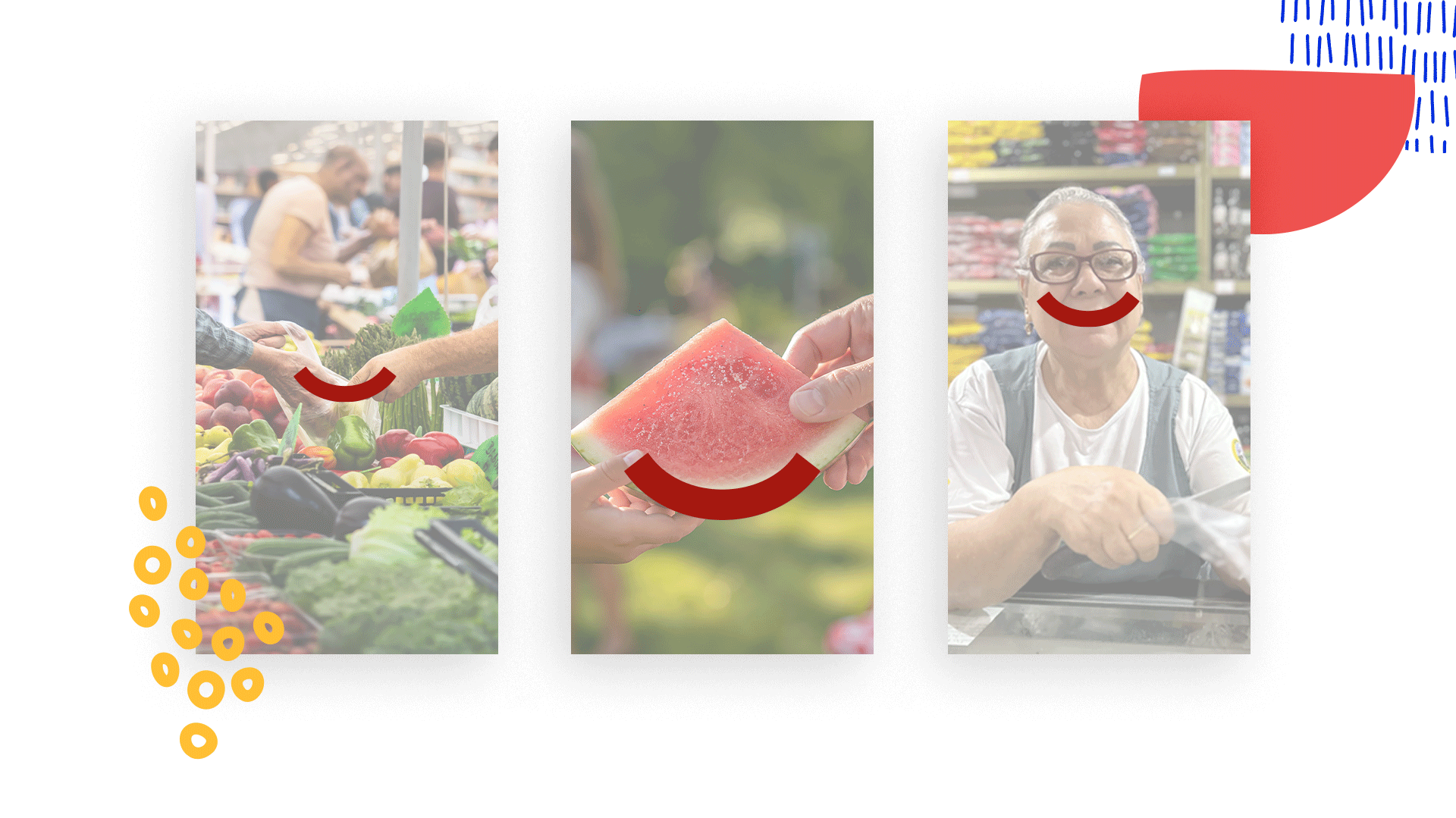
Three photographs of a produce purchase, a watermelon slice and a smiling woman, linked by the symbol’s red curve.

The identity of Mercado São Paulo brings together familiarity and discovery: the reassurance of returning to a place you know and the pleasure of finding a flavor, a product or a thoughtful gesture that makes that visit special. The brand gives shape to this bond, built through small, everyday experiences.

The curve of the symbol runs through this world. It appears in the smile of someone offering a warm welcome or finding what they were looking for, in the shapes of fruits and vegetables, and in the outlines of plates brought to the table. Its design brings food, affection and togetherness into one simple gesture, inviting different associations with what makes a market feel close to its community.
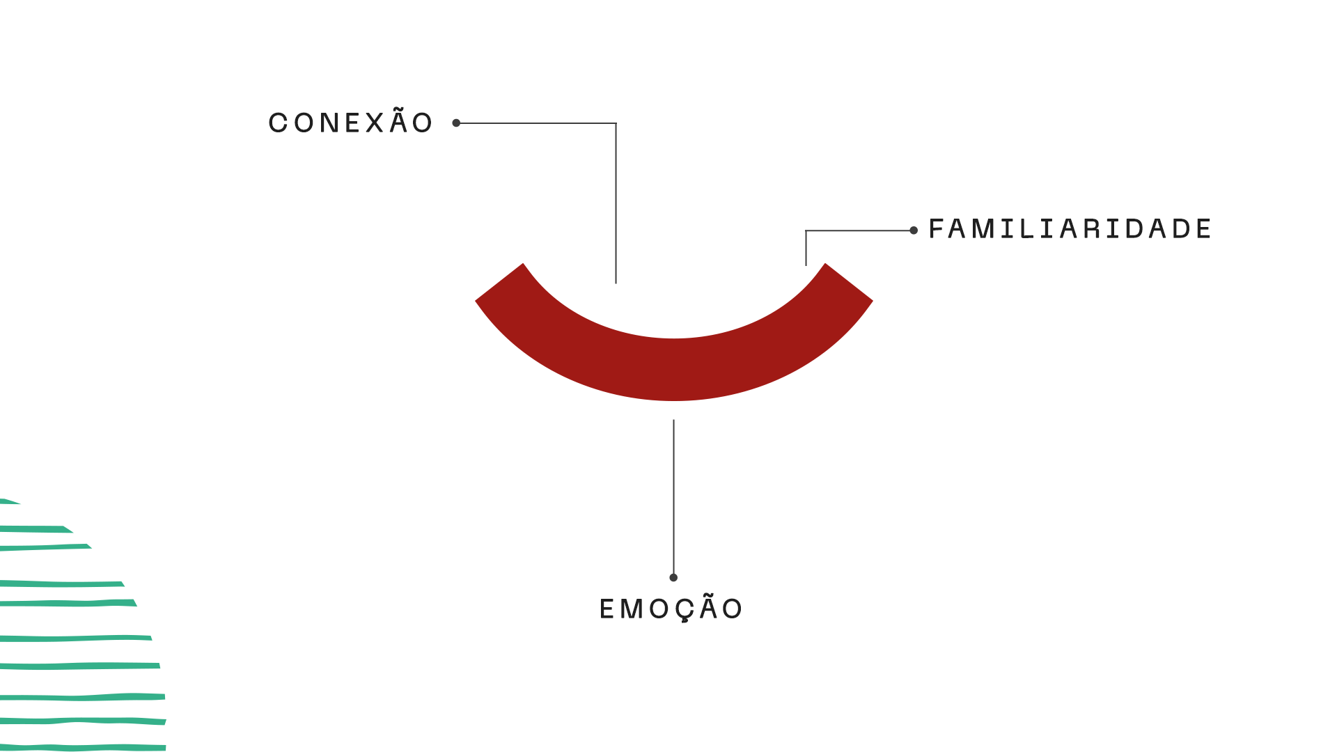
The symbol’s red curve presented with the Portuguese concepts meaning connection, familiarity and emotion.
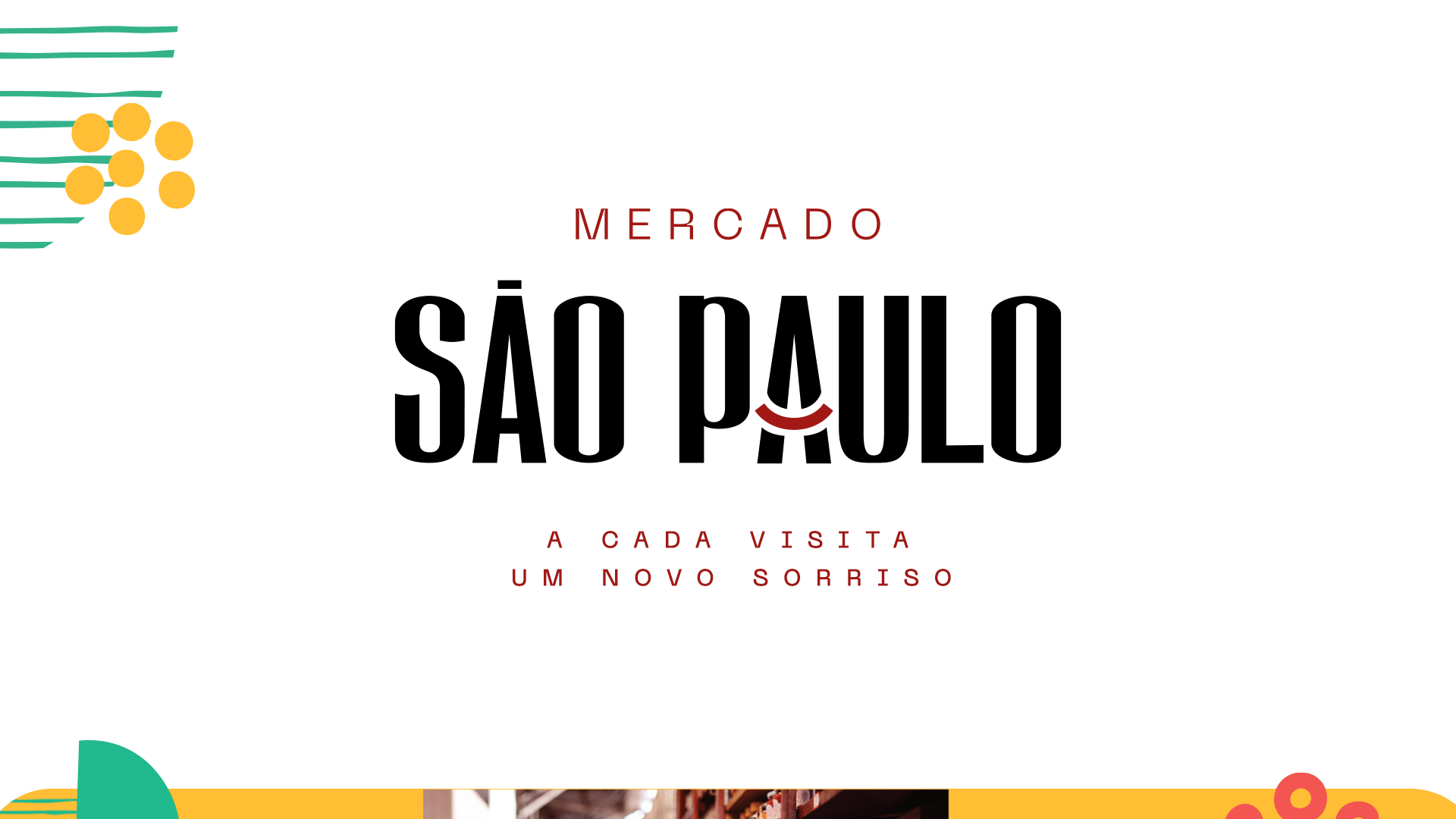
Mercado São Paulo logo in black and red, with the Portuguese tagline meaning “A new smile with every visit” and colorful graphic elements.
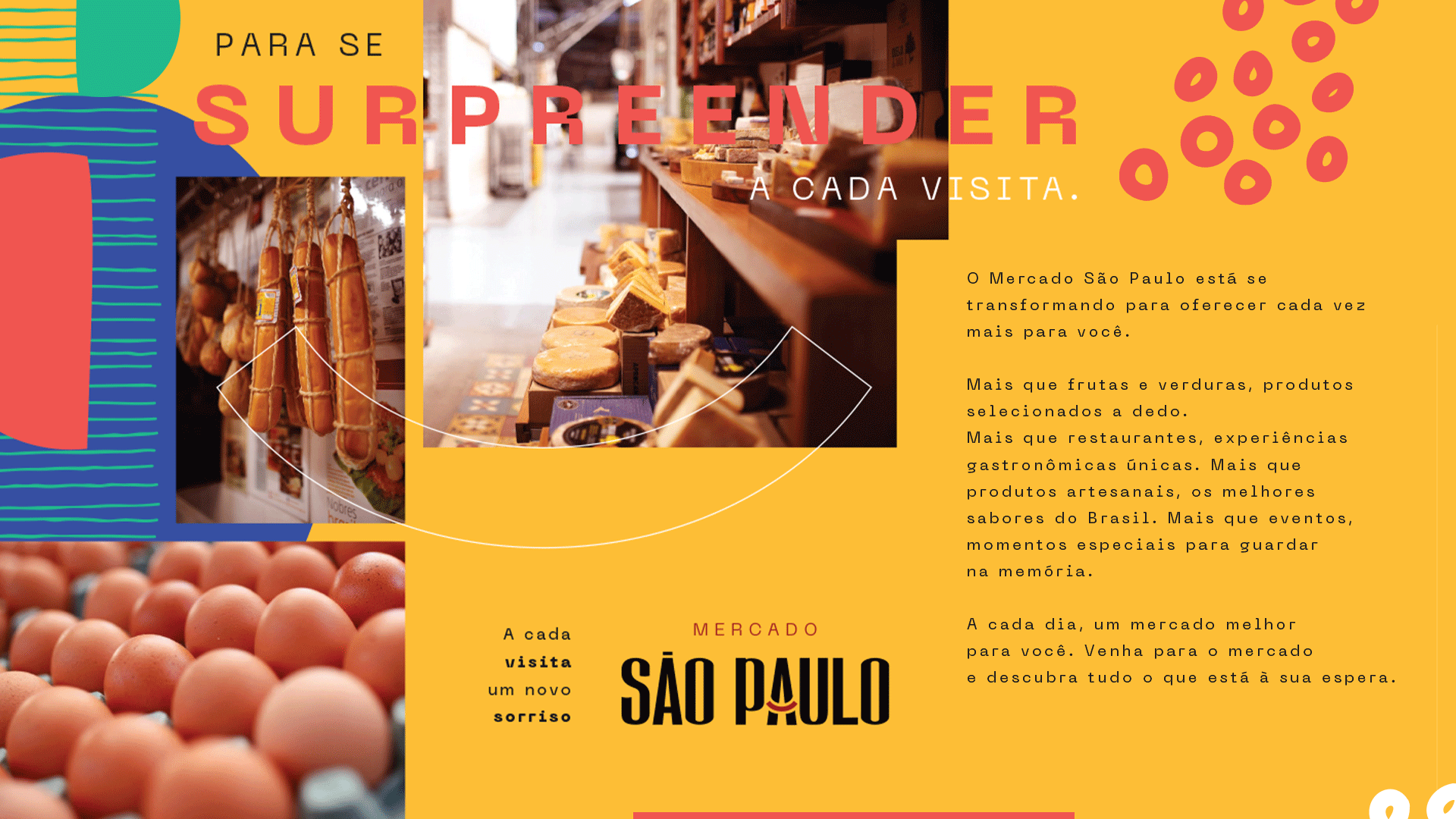
Yellow presentation board featuring food, graphic elements, the Mercado São Paulo logo and a Portuguese manifesto about discovering something surprising on every visit.
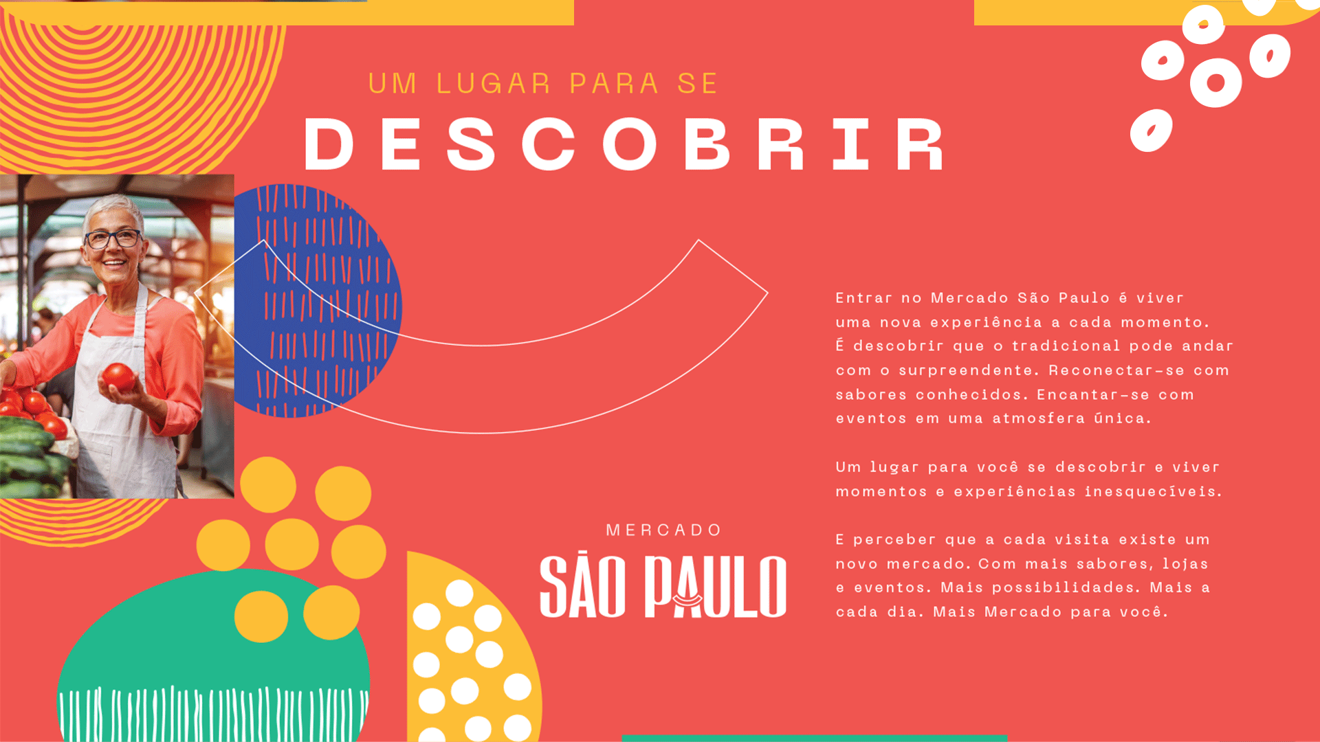
Red presentation board featuring a smiling woman at the market, colorful elements and Portuguese text meaning “A place to discover yourself”.
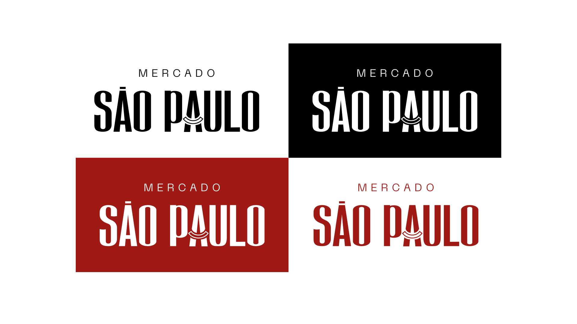
Four versions of the Mercado São Paulo logo in black, white and red, demonstrating applications on light and dark backgrounds.
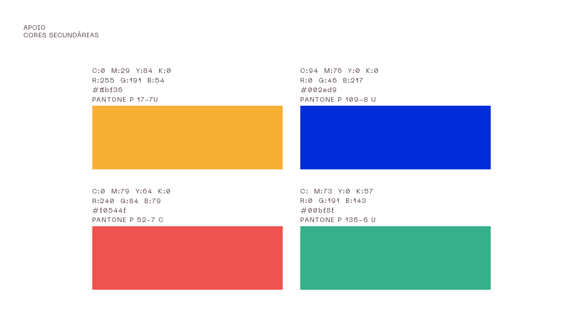
The identity’s secondary color palette, with yellow, blue, red and green swatches and color reproduction specifications.
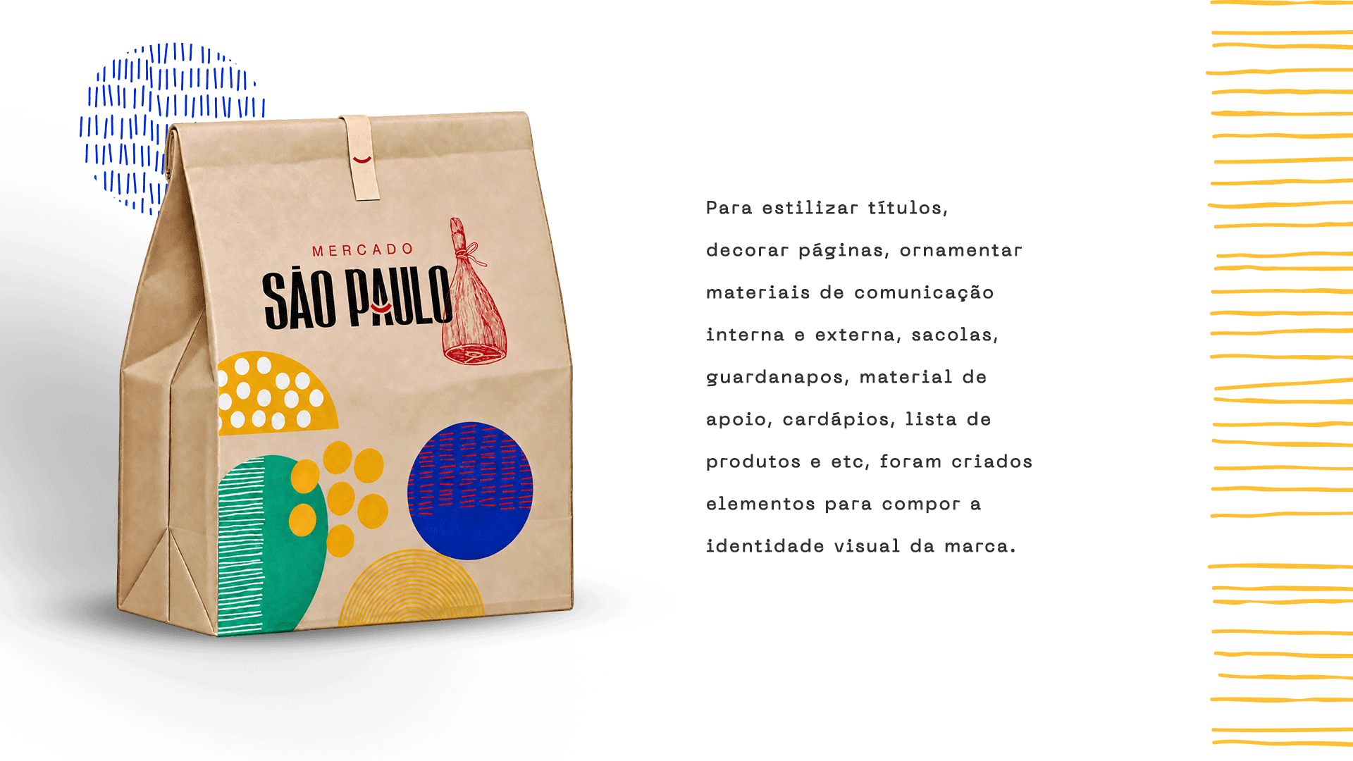
Mockup of a kraft paper package featuring the Mercado São Paulo logo and colorful graphics, alongside text about applications of the identity.
Collection of geometric shapes, circles, lines and textures in red, blue, green and yellow.
Enlarged composition of blue, green and red graphics against a yellow background.
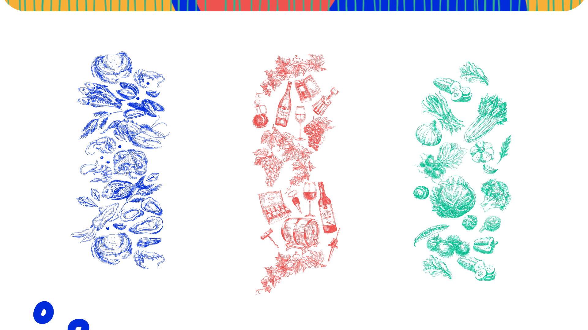
Three groups of line illustrations: fish and seafood in blue, wine in red, and vegetables in green.
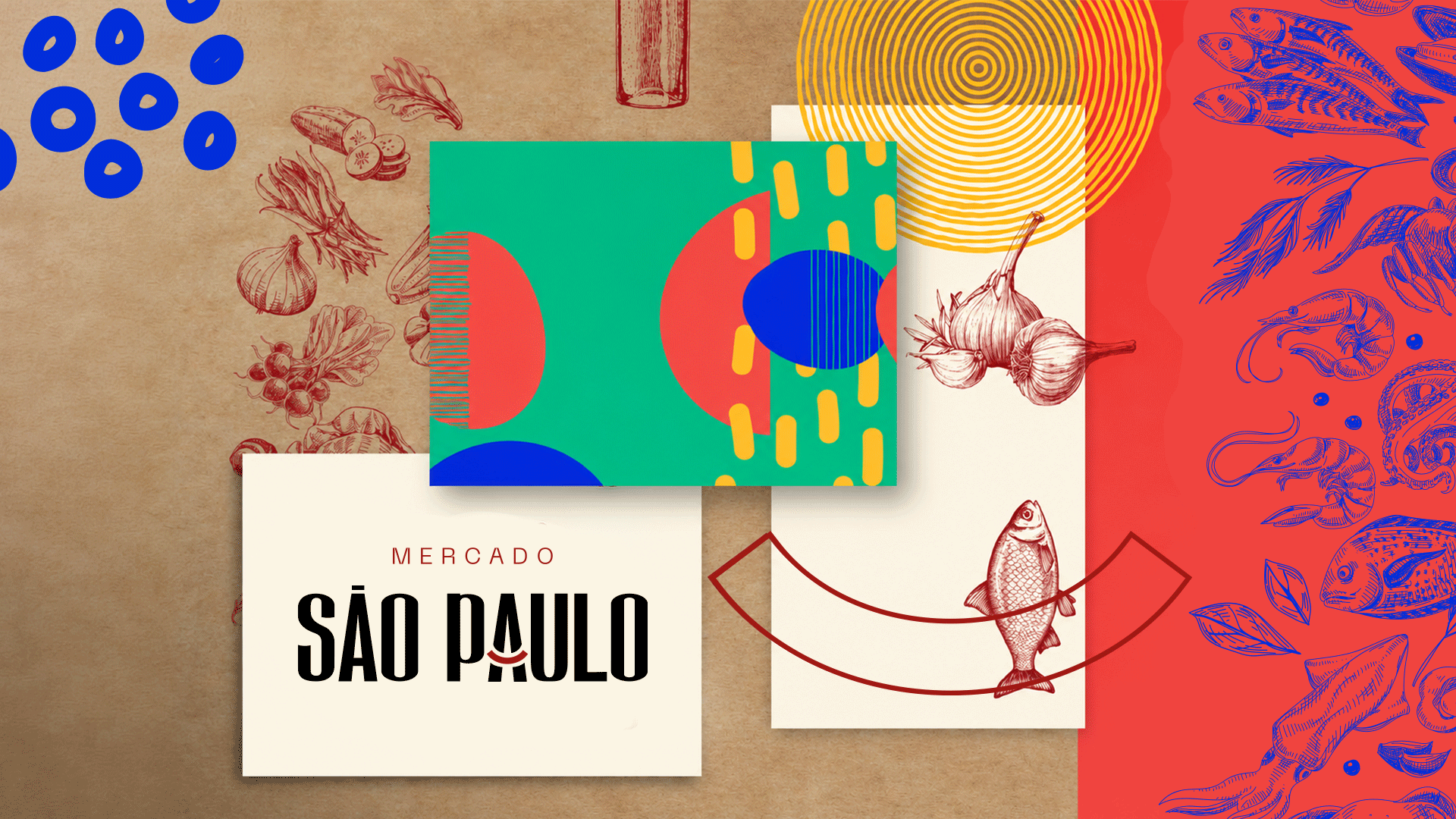
Mercado São Paulo identity board combining the logo, colorful graphics and food illustrations against kraft paper.
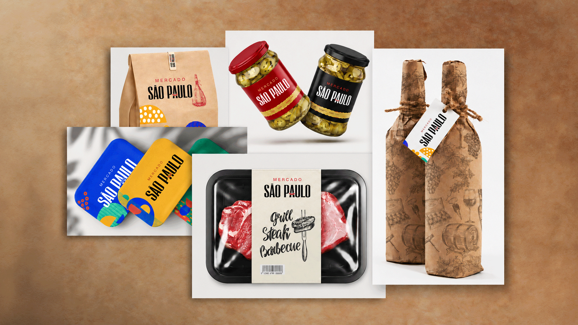
Mockups of Mercado São Paulo packaging, including a paper bag, jars, bottles, colorful trays and meat packaging.
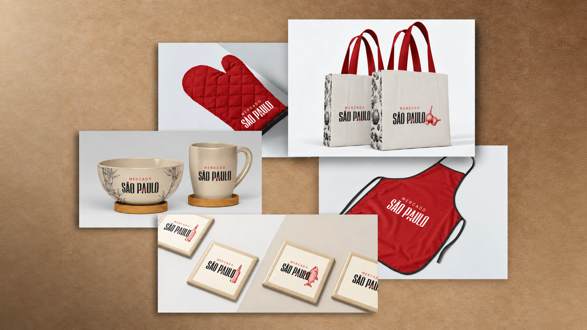
Mercado São Paulo branding applied to an oven mitt, tote bags, a bowl, a mug, coasters and a red apron.